Black Hats
Packaging, Branding, Digital
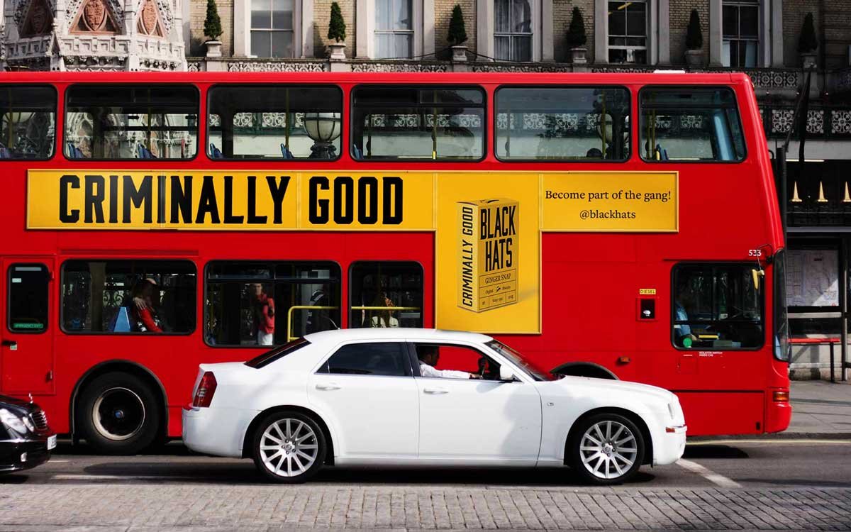
This packaging, with its interlocking design, works as a collective and evokes the gang mentality of the Black Hats. The bold colours and distinctive font are a further nod to the original gang’s creativity and fearlessness to conceal the illegal contraband. The cohesive colour palette, composed of striking contrasts and strong, dominant hues, not only enhances visual impact but also strengthens the overall brand identity. The typography, bold and unapologetic, features sharp angles and powerful letterforms that mirror the gang’s unwavering attitude. Together, these elements create a unified design system that speaks to the brand’s bold, rebellious ethos, ensuring recognition and reinforcing the narrative of strength and defiance.
Client: Student Brief
‘Black Hat’- a phrase used to describe a criminal, and in this case a well known group of rum runners.


Disclaimer: This is all concept work for a student brief. If you would like to see more work on this project, please get in touch.


